Honeywell International does not limit itself to one area of activity. It manufactures a huge range of products from thermostats to barcode devices. Separate divisions are engaged in the development of construction and industrial technologies. Also, the company makes state-of-the-art materials and even operates aerospace plants. Therefore, it is not surprising that the same firm can simultaneously produce paper shredders, household generators, airplanes, and rockets.
Meaning and History
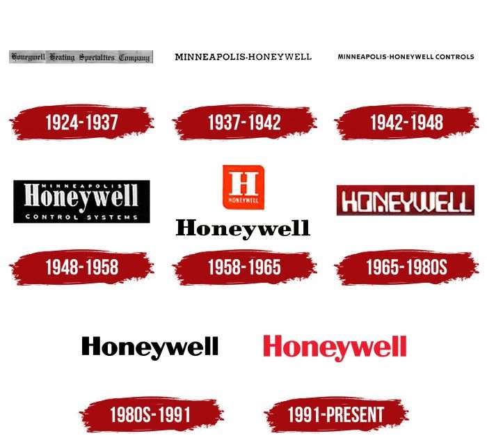
The evolution of logos traces the history of Honeywell. And it was very turbulent because this corporation repeatedly changed its name and absorbed other companies to get their technology. Its wordmark has always reflected the current name – be it Honeywell Heating Specialty Company or Minneapolis-Honeywell. Each variant had a different font, including emblems with a single “H” in a rectangle. The colors also varied, but most of the writing was either black or red.
1924 – 1937
Until 1927, there were two separate companies: the Honeywell Heating Specialty Company, formed in 1906, and the Minneapolis Heat Regulator Company, which was founded in 1885 under a different name. Both of them were engaged in thermostats and automatics for coal stoves, so they entered the struggle for leadership. Due to conflicts of interest, they had to merge into the Minneapolis-Honeywell Regulator Company. The merger took place in 1927, and before that, the inventor Mark Honeywell company used the logo with the words “HONEYWELL HEATING SPECIALTY COMPANY.” The Old English typeface with complex textural shapes was in keeping with the spirit of the time.
1937 – 1942
In 1937, 10 years after the two competing enterprises merger, the newly formed company had about 30,000 employees. Its emblem bore the abbreviated name: “MINNEAPOLIS-HONEYWELL.” The hyphen between the words looked like a bullet. The font was far from medieval classics. This time, the designers preferred an antique with thin, straight lines.
1942 – 1948
One of the earliest logos contained the words MINNEAPOLIS-HONEYWELL CONTROLS. The last word indicated the type of product the company was making: control thermostats for heating systems. The serifs have disappeared, and the letters have taken on a sharper shape.
1948 – 1958
The next emblem also mentioned the main product of the manufacturer: “CONTROL SYSTEMS.” The phrase was found under the word “Honeywell,” where only the first “H” was capitalized. For the first time, designers used lowercase letters for a company name. At the very top, between the “H” and “ll,” the small print read “MINNEAPOLIS.” The light gray text was inside a black rectangle.
1958 – 1965
In 1958, a combined logo appeared, consisting of a black lettering “HONEYWELL” and an orange rectangle with a large white letter “H” and a small word “HONEYWELL.”
1965 – the 1980s
In the second half of the 20th century, the company adopted a wordmark with a white “HONEYWELL” inside a burgundy rectangle. The typeface became stylized for the first time: it was not an ordinary grotesque, but a version with disproportionate letters.
the 1980s – 1991
The designers removed the inscription from the rectangle and repainted it black. Also, they changed the font, making the lines symmetrical.
1991 – today
In anticipation of the new millennium, the company slightly modified the logo. As a result, the lettering turned red, and the overall style did not change.
Font and Colors of the Emblem
An international corporation has always had a word mark – both now and a hundred years ago. The only exception was the orange square emblem with the letter “H” inside. This was exactly the secret of Honeywell’s popularity: the company made its name a center of visual identity and made everyone recognize it.
Endless experiments with the design of the lettering ended with the designers settling on Helvetica. At least this particular font is listed in the branding guide. But if you pay attention to the details, small differences become noticeable. Another similar typeface is the Britannic Bold.
The company chose the color the easy way: its logos are either black or red. The current version uses a bright shade called Honeywell Red (# EE3124) for the word and Brilliant White (#FFFFFF) for the background.


